
I recently had my identity temporarily stolen by a German fashion designer who hacked my LinkedIn. It’s a strange feeling to be rebranded against your will. I can’t help but see a parallel in Jaguar’s latest effort. This isn’t a rebrand born from a triumphant new product; it feels like a move forced by circumstance. The brand had lost its relevance, and with no new cars to show for at least a year, it had to do something. This campaign feels less like a confident leap forward and more like a desperate attempt to stay in the conversation. What was Jaguar thinking with this high-stakes gamble?
For the last couple of days, I’ve been preoccupied with two rebranding efforts. The first one you haven’t heard about, which is the hacking of my LinkedIn account. Somewhat amusingly, this briefly saw my identity change to that of a German woman with an enviable career in fashion design. I have no idea what the dark-web’s motivation was with this caper but please people – update your passwords, even on the sites you don’t really care about. The other rebranding effort you may have heard of is Jaguar. If stories about this rebrand have made it to your feed, it’s likely for the wrong reasons. The troll-y side of the internet is tediously criticizing this work for being woke, but I won’t let them take away my right to criticize it for just being questionable rebranding. At this point you should look at the film that accompanied the relaunch if you haven’t seen it. Well, what did you think? You may be wondering how they forgot to show cars in their car brand rebranding, but they didn’t forget, there are no cars to show you. That’s right, Jaguar doesn’t have a new car to show you and won’t for a year or more, while they completely retool their lines from ICE vehicles to EVs. Instead, this rebranding is about a bold vision for where the company is going…
Create exuberant Live vivid Delete ordinary Break moulds Copy nothing
They say that all attention is good attention. But of course, we know there is bad attention, and if I was pressed to define it, I think it might look something like this. What is intended to be unique and striking, appears remarkably generic and unintentionally hilarious. Apparently, Jaguar has a bit of a relevance challenge. It had long ago lost its luster as an innovative car maker and its moves down-market had even called into question its status as a luxury brand. At a point when other brands might be calling it a career (think Oldsmobile), Jaguar’s owner Tata is committed to saving this storied brand (and I’m guessing large financial incentives from the UK government probably played a role, but admittedly I haven’t bothered to look that up). So, it’s time to wipe the slate clean and let Jaguar be evaluated on the boldness of its vision and the quality of its vehicles. Not the vehicles it has made for the last 50 years, which I understand were rife with quality issues. But its new, as yet imaginary vehicles, that involve completely new capabilities to design, manufacture and keep on the road. What could go wrong? 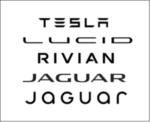 The heart of this rebranding is a new visual identity. While I am not a designer, that has never stopped me from having an opinion about design. A key promise of the refreshed brand is to “copy nothing”, so of course the first act of the new brand was to ignore that with its identity. What do all successful EV brands need? Why a symmetrical wordmark of course (see logos). There are no dangly bits in their names that would mistake them for an old-school brand still powered by dinosaur juice. The dangly bits are technically called “descenders” – think lower-case “g” or “j”. So how did Jaguar’s rebrand move to a lower-case font and still stay in their symmetrical box? They just kept the capital “G” and added a story about how it alludes to how the name is pronounced. Ah, chef’s kiss to you still-symmetrical Jaguar. If my analysis of this rebranding sounds a bit cynical, I think that’s kind of on brand with what Jaguar appears to be doing. While the imagery is probably intended to say, “we’re a bold, confident disrupter”, what I’m really hearing is, “please don’t forget about us while we go off for a while and figure out how to make electric cars”. Anyway, as I learned this weekend, it’s a little scary when circumstances force you to rebrand, so I genuinely wish Jaguar well.
Frequently Asked Questions
Why would a company rebrand itself when it has no new products to show? This is the central question, isn’t it? A move like this is typically a high-stakes attempt to keep a brand relevant during a long, quiet period of internal change. Jaguar is essentially trying to sell a vision of its future self to prevent customers from forgetting about them entirely while they retool their factories for electric vehicles. It’s a strategy to bridge a gap, but it’s risky because it relies purely on promises, not products.
What makes this rebranding feel “generic” if the goal was to be bold? The campaign uses a lot of abstract, energetic language like “Create exuberant” and “Delete ordinary.” While these phrases sound bold, they aren’t connected to anything tangible about the cars or the driving experience. It feels like it’s pulling from a standard “disruptor brand” playbook rather than telling a story that is uniquely Jaguar’s. The promise to “copy nothing” is also immediately undermined by a logo design that feels very similar to other EV brands.
What are the biggest risks of this “rebrand now, build later” approach? The primary risk is that the conversation and excitement will completely fizzle out long before the new cars are ready. A brand can only run on vision for so long. If there’s a significant delay or if the final products don’t perfectly match the grand promises made in this campaign, it could seriously damage their credibility. They’re creating very high expectations that their future products will now have to meet or exceed.
You were critical of the new logo. What’s the problem with it? The issue isn’t with the design itself, but with the strategy behind it. The rebrand’s tagline is “copy nothing,” yet the new lowercase, symmetrical wordmark follows a clear design trend set by other successful EV companies. It’s an ironic first step that contradicts their core message of originality. It suggests they are more focused on fitting into the current EV market than on defining a new path forward.
What’s the main lesson other leaders can take from Jaguar’s situation? The most powerful rebrands are anchored in tangible proof. Your brand’s story should be an expression of a real change in your business—a groundbreaking product, a new customer experience, or a fundamental shift in your service model. When you rebrand based only on a future promise, you’re asking your audience for a huge amount of trust. It’s a much stronger strategy to let your actions and innovations lead the way, and then wrap a new brand story around that proven success.
Key Takeaways
- Rebrand with proof, not just a promise: A brand transformation is most effective when it’s anchored to a tangible business evolution, like a new product or service. Without that proof, a rebrand can feel like a placeholder, not a powerful statement of change.
- Your execution must embody your message: Authenticity is critical. When a brand’s core promise—like “Copy nothing”—is immediately contradicted by its creative choices, it undermines the entire strategy and invites skepticism.
- A new brand can’t fix a product problem: Rebranding should be used to amplify a fundamental business shift, not to distract from a lack of innovation or a gap in your product pipeline. It’s a powerful tool for signaling change, not a temporary fix for deeper issues.
Related Articles
- Really, Jaguar? – Vivaldi Group
- Revving Up Hyundai + Kia’s Brand Portfolio Strategy | Vivaldi
- Understanding the Brand Relationship Spectrum
- Crafting Philips’ Future with a Refined Brand Strategy
- Helping Dacia Unleash its Unconventional Spirit